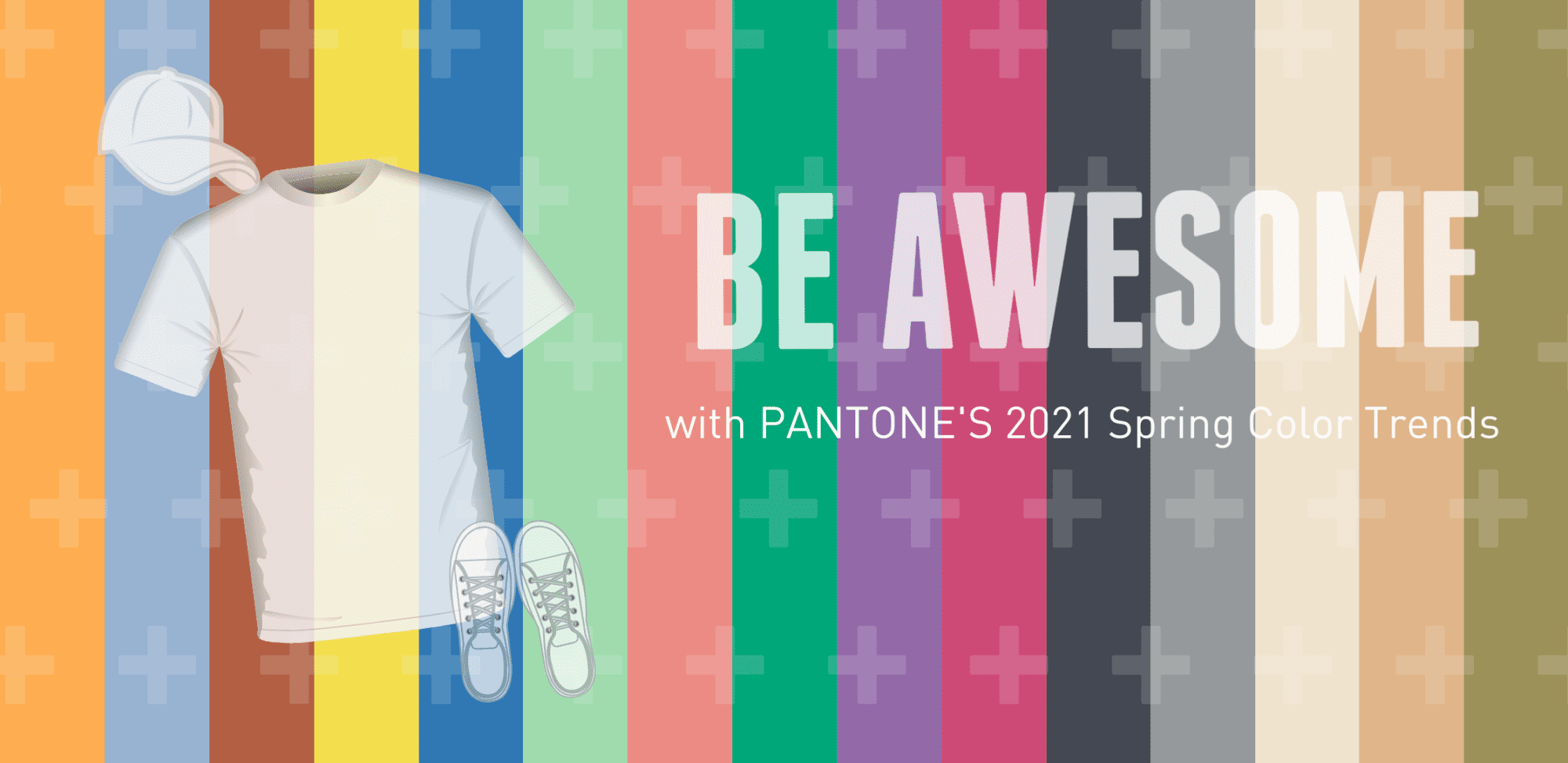
After being cooped up for months, we need a little joy and renewal, and that is exactly what this year’s Spring Colors promise. This pallet offers a range of shades exemplifying nature, combining comfort and rest with sparks of energy to uplift our moods.
Above is illustrated each shade, and listed in order below, the creative Pantone’s name and description.
Have fun allowing your ideas to come to life as you gaze through the colors!
♦ ♦ ♦
Marigold
A comforting golden orange-infused yellow lends a warming presence.
Cerulean
The color of the sky on a serene, crystal clear day.
Rust
An earth-inspired brown emblematic of Autumn leaves uncharacteristic of a spring palette.
Illuminating
Friendly and joyful, an optimistic yellow offering the promise of a sunny day.
French Blue
A stirring blue hue that awakens a vision of Paris in the springtime.
Green Ash
A mentholated Green that cools and soothes.
Burnt Coral
Inviting Burnt Coral expresses conviviality.
Mint
Tasty mint refreshes and restores.
Amethyst Orchid
The floral shaded amethyst orchid introduces a unique touch.
Raspberry Sorbet
Vivifying Raspberry Sorbet tantalizes.
Inkwell
A deep and intense blackened blue.
Ultimate Gray
Quietly assuring and reliable gray encouraging composure.
Buttercream
Smooth Buttercream is an easy and effortless delicious off-white.
Desert Mist
Invoking images of shifting powdery sands.
Willow
A canopy of green that reveals and conceals.